ACS Data
The choropleth map color indicates the percentage of families living below poverty threshold in the zip code. (Hover/zoom in to see detail)
The choropleth map color indicates the percentage of families living below poverty threshold in the zip code. (Hover/zoom in to see detail)
City Data Analysis
NYC offers open data (via https://nycopendata.socrata.com/) more than any other cities in U.S according to Open Knowledge Foundation (http://us-city.census.okfn.org/).
I was fortunate enough to take advantage of its available data.
NYC offers open data (via https://nycopendata.socrata.com/) more than any other cities in U.S according to Open Knowledge Foundation (http://us-city.census.okfn.org/).
I was fortunate enough to take advantage of its available data.
|
|
|
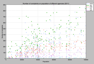
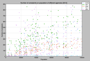
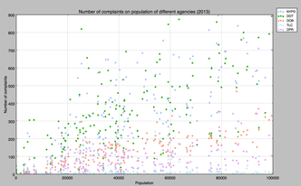
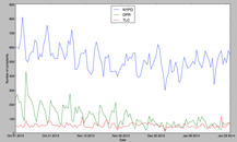
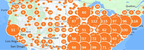
Number of complaints in 2011, 2012 (Sandy), 2013 by populations + agencies
|
|
|
|
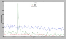
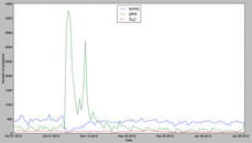
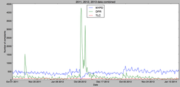
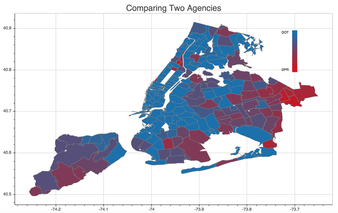
Top 3 agencies and number of complaints in 2011, 2012 (Sandy), 2013, and combined
|
|
|
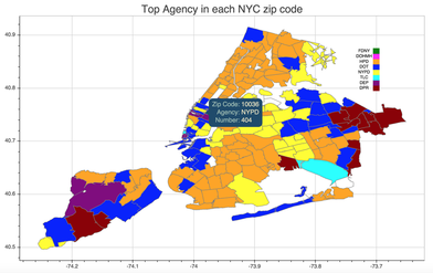
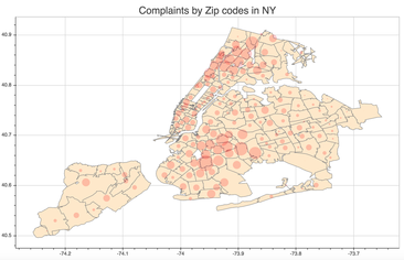
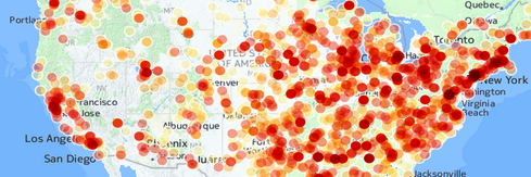
NYC 311 complaints in different views (python + Bokeh)
|
|
|
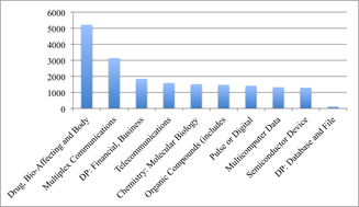
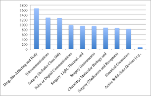
Top 10 patents types: NY, LA, Seattle
|
|
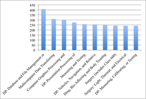
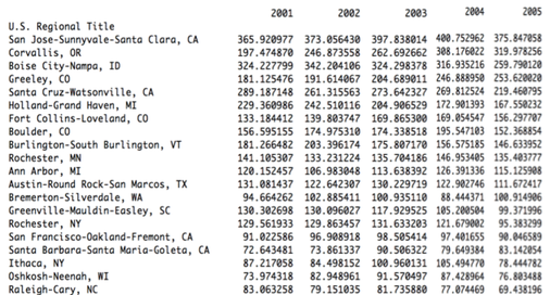
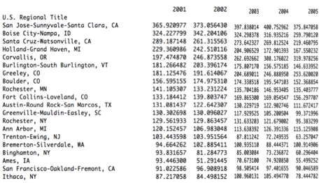
Patent Intensity sorted by 2005 and 2001 descending order
|
|
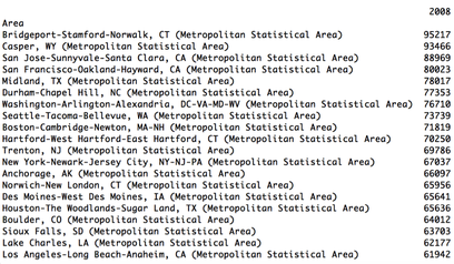
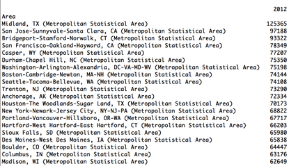
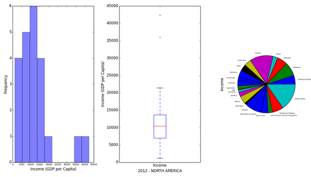
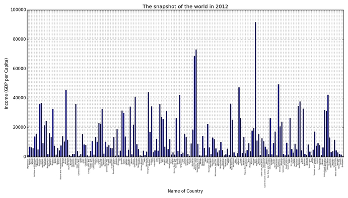
GDP per capita 2008, 2012
|
|
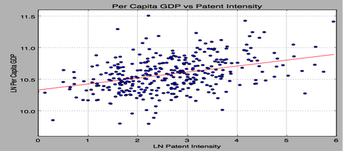
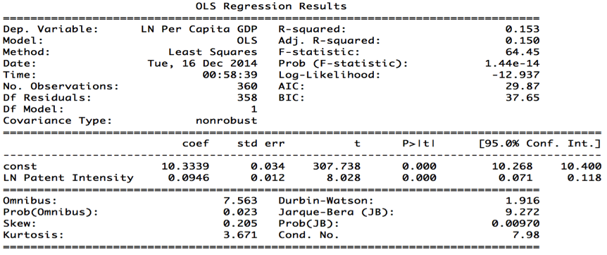
GDP vs Patent per capita: The coefficient is 0.09 and R-squared value is 0.153
|
|
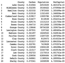
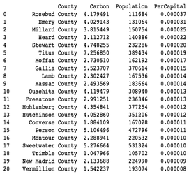
Ranking of LEAST emission county per capita vs the MOST emission county per capita (based on the year 2002)
|
|
Emission, emission, emission. We need clean air!
|
|
|
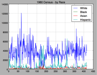
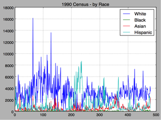
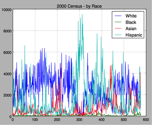
Orange County census - 1980, 1990, and 2000. y: number of population x: msa code
|
|
|
|
|
|
|
|
|
|
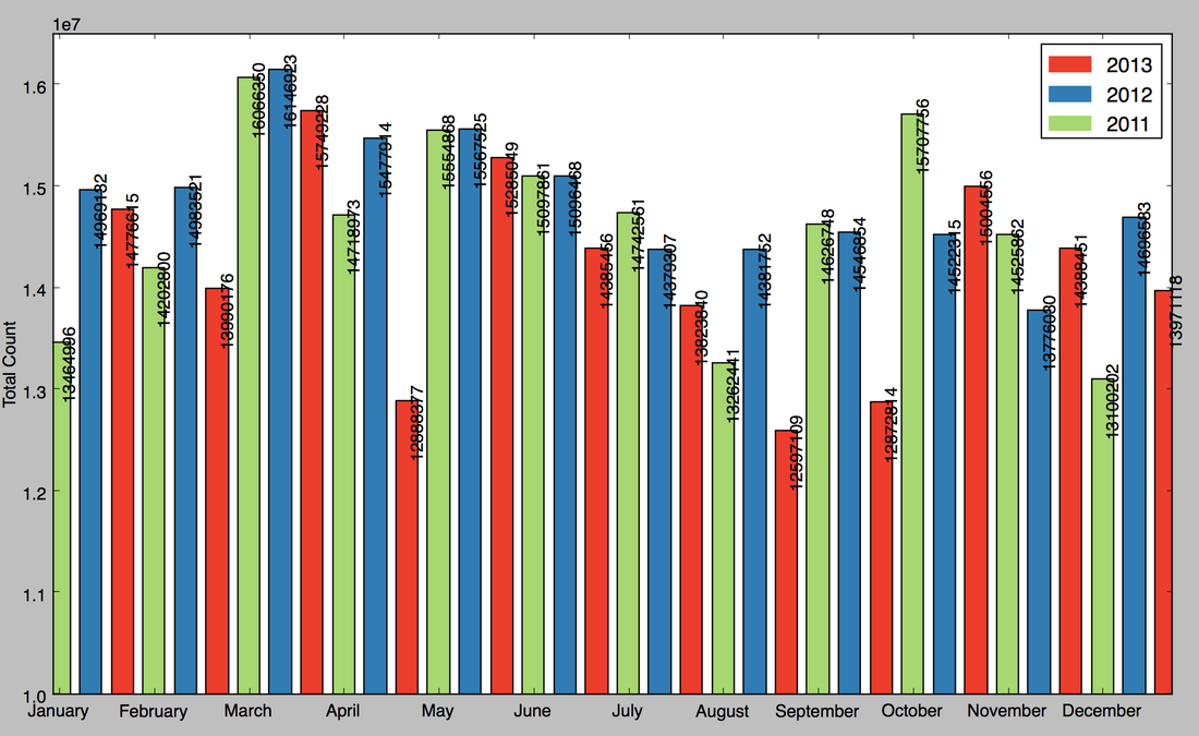
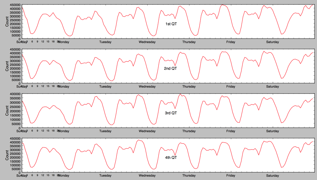
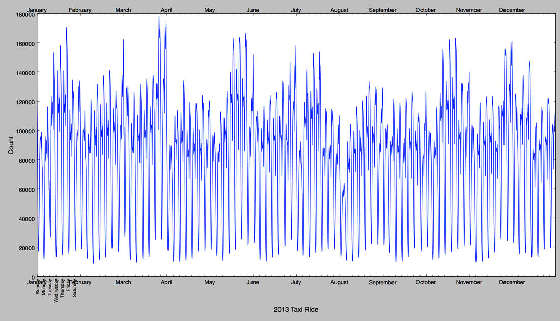
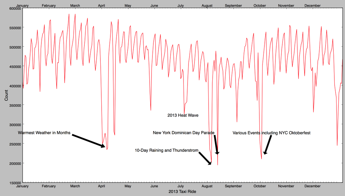
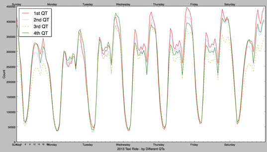
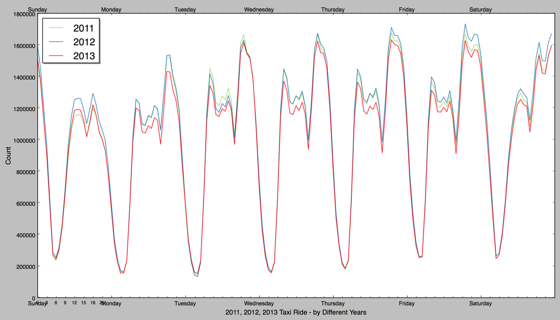
2011, 2012, 2013 NYC Taxi data (90GB) - Tools: Hadoop MapReduce, Python
App Dev
Army PTMaster for Android - A 'military style' (reads: simple) app to calculate routine physical fitness test.
